
Create a consistent visual system with text and color styles
Choose reusable typography and neutral colors, distinguish editor appearance from website themes, and review contrast on real content.
Soidesmax · 4 min read · Updated 2026-10-20
Give North Studio a recognizable voice
You have content and structure. Now define a small design system so the site feels deliberate. Your task is to style Home and About consistently using a limited typography scale and a few reusable colors. Start simple: one font family, clear heading levels and a neutral background.
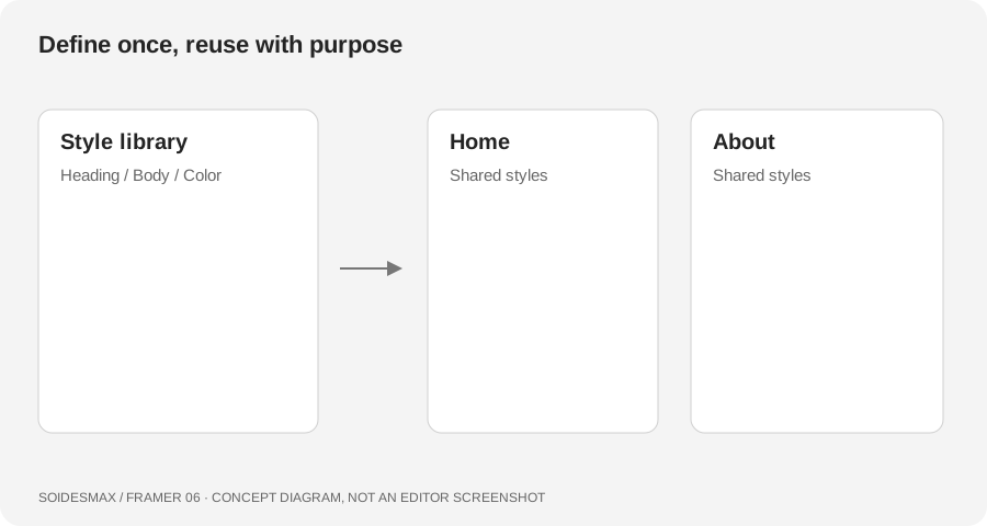
Original learning diagram.
1. Plan the styles before changing every layer
Make a short list: Page Title, Section Title, Body and Small Text. For practice, try 48-pixel page titles, 32-pixel section titles and 18-pixel body copy on a wide screen. These are starting values, not official Framer defaults. Adjust them to your font and check the result on a phone.
For color, try a near-white surface, dark gray text, a medium gray for secondary text and a subtle border. Use a deliberate accent only if it serves a purpose. Near-white and charcoal do not need a green tint to feel soft.
2. Create and apply reusable text styles
In Assets, use the Styles add control to create a Text style and choose an appropriate heading or paragraph type. Select a text layer, then apply the style through Text → Styles in the properties panel. Repeat for representative headings and paragraphs on both pages.
Edit the shared style once and check every place using it. A local font change on a single layer is not the same as changing the reusable style. If one heading refuses to match, inspect its selected style and local overrides before creating another almost-identical style.
3. Check smaller text settings
The text-style editor provides breakpoint settings for typography. Add and tune the sizes you need rather than scaling everything by eye on individual pages. Test long words and two-line titles. Remember the component-specific limitation from lesson 4: page text breakpoints do not automatically solve every component's typography.
Keep semantic meaning separate from visual size. A small heading can still be a heading; a very large promotional sentence does not become a page title merely because of its font size.
4. Separate editor theme from website theme
Framer's editor can appear light or dark. Your published site's colors come from the design and its color-style setup. Switching the editor theme is not a complete replacement for building and testing a visitor-facing theme.
If your template includes light/dark color values, inspect both values before changing them. Try a neutral dark background with light gray text, then check buttons, borders, form fields, illustrations and images. Avoid inverting uploaded photographs. If you only need one website theme, keep that choice explicit and review the current color-style options rather than deleting arbitrary layers.
5. Run a readability check
Read a full paragraph at normal browser zoom. Can you distinguish links, focused controls and muted text? Navigate with the keyboard and make sure the current focus remains visible. Do not use color alone to distinguish an error or a selected state.
Fix common inconsistencies
- One paragraph looks different: inspect its text style and local formatting.
- A global change affects too much: undo and split styles by purpose before retrying.
- Dark mode has bright fields: check field surfaces and placeholder/text colors.
- A heading is clipped: review its line height and container height.