
Replace text, images and links without breaking a template
Replace placeholder content, choose image crops, add useful alt text, and check every destination before you publish.
Soidesmax · 4 min read · Updated 2026-10-20
Prepare your content first
Create a small folder containing your own logo, two project images and a short text document. For North Studio, prepare a headline, introduction, service description and contact address. Use images you own or have permission to publish. Rename source files so you can recognize them later.
The objective is to replace the meaning of the template while preserving its useful structure. Do not delete a whole section just because you cannot immediately select its headline.
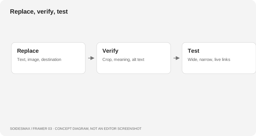
Original workflow diagram, not an editor screenshot.
1. Find where the content comes from
Select the item through Layers. Ask whether it is ordinary page content, a component instance with exposed controls, or content connected to CMS fields. These need different edits. For a CMS-bound article title, edit the collection item rather than replacing the binding with fixed text. For a button component, look for its text and link controls before editing the shared component.
2. Replace text in small passes
Edit one section at a time. Start with the headline and introduction; preview them at desktop and phone widths before moving on. Keep headings meaningful and avoid using a heading solely to obtain a large font. Replace placeholder company names in the footer, menus and secondary pages as well as the obvious hero.
Use the actual text you intend to launch with. A longer service name can wrap differently, so check its parent container and height. Do not shrink body text until it becomes difficult to read just to preserve a placeholder layout.
3. Replace and describe images
Select the image or the layer using an image Fill. Open the image controls and choose your file. Check whether the design is cropping to fill its frame or showing the entire image. A portrait placed in a wide frame may need a different crop or a different source image.
Add descriptive alt text through the image's controls. Describe meaningful content, for example A ceramic cup beside North Studio's printed identity samples, rather than repeating a filename. For CMS images, manage the relevant image and alt information in the collection workflow. Preview both the wide and narrow layouts after changing the crop.
4. Verify links deliberately
Select the intended clickable layer and inspect its Link setting. Use the correct internal page for navigation, an external address for another website, or a section target for a page anchor. Check whether the template already exposes its destination as a component property.
For the practice site, connect the main call to action to Contact, the logo to Home, and the footer's Journal link to the Journal page. Do not leave a real-looking purchase or booking button pointing to the template creator's destination.
The final content sweep
Open Preview and click every navigation item, card and button. Check destinations on the published test version too. Search visually through About, Contact, footer, error pages and CMS sample items for leftover names, addresses or demo testimonials. Remove unsupported claims rather than turning sample testimonials into invented customer quotes.
Troubleshooting
- Every button's text changes: you edited the shared source; use instance controls where available.
- Image looks blurry: use an appropriately sized original rather than enlarging a tiny thumbnail.
- An image shows the wrong part: adjust the crop, not just the layer's width.
- Links work only in one menu: inspect desktop and mobile component variants separately.